VBL Work
Product
Visual Brand Language
Industry
Home Appliances
Year
2024-2025
Role
Working as part of a small dedicated team over the course of one year, I focused on translating the emerging visual brand language into tangible product concepts. I had particular ownership over much of the CAD development, visualization, and the exploration and refinement of the signature handle system, creating manufacturable designs that balanced brand identity, usability, and production constraints.
Credits: Chris Bissig, Arvid Al Chalabi, Emilio Morales, Hannah Paasche
Developing the next-generation Visual Brand Language for one of GE Appliances’ core brands. A business-critical initiative to refresh the brand and establish a cohesive, future-focused design direction.
The Need for Visual Independence
GE and Profile currently share the same hardware. As a brand Profile had outgrown this visual identity. As Profile products became smarter and more premium so did the price, but the brand lacked a design language capable of separating itself from the GE line of products.


Defining the Design Principles
Trend forecasting wasn't used only to predict aesthetics, it was used to understand lasting shifts in how people experience technology and the home. These insights became a set of design principles that guided every decision, from form and materiality to interaction and proportion, ultimately shaping the foundation of the new visual language.

Translating Brand into Form
Style boards enabled rapid exploration of a broad range of visual directions. Combining inspiration imagery with 2D layouts and early 3D studies helped define unique approaches to color, pattern, and form. Through iterative refinement, two concepts emerged as clear contenders: Foxtrot and Echo. Each representing opposite ends of the design spectrum.


Converging on a Design Language
This concept (Gamma) combined the quiet precision of Foxtrot with the warmth and expressiveness of Echo, creating a visual language that felt both refined and approachable. Guided by the design principles established through research, it preserved Profile's technology-forward identity while reducing visual complexity. The result was a cohesive foundation designed to scale across an entire ecosystem of products.


Testing the Language Across Products
With Gamma defined, the language needed to prove it could scale without losing coherence. Testing across product categories confirmed the visual direction, but translating it into 3D forced meaningful refinements.

Core Visual Elements
Profile's core visual elements reinforce its design principles, each working to reduce visual overload, reintroduce calm into the home, and restore a physicality that most modern appliances are lacking.

Applying The Design Language
Refrigeration became the proving ground for the emerging design language. Details from Gamma were updated and translated into manufacturable forms while balancing ergonomics, engineering constraints, and visual consistency. This phase transformed the language from a 2D conceptual vision into a tangible product experience.

The Main Visual Cue
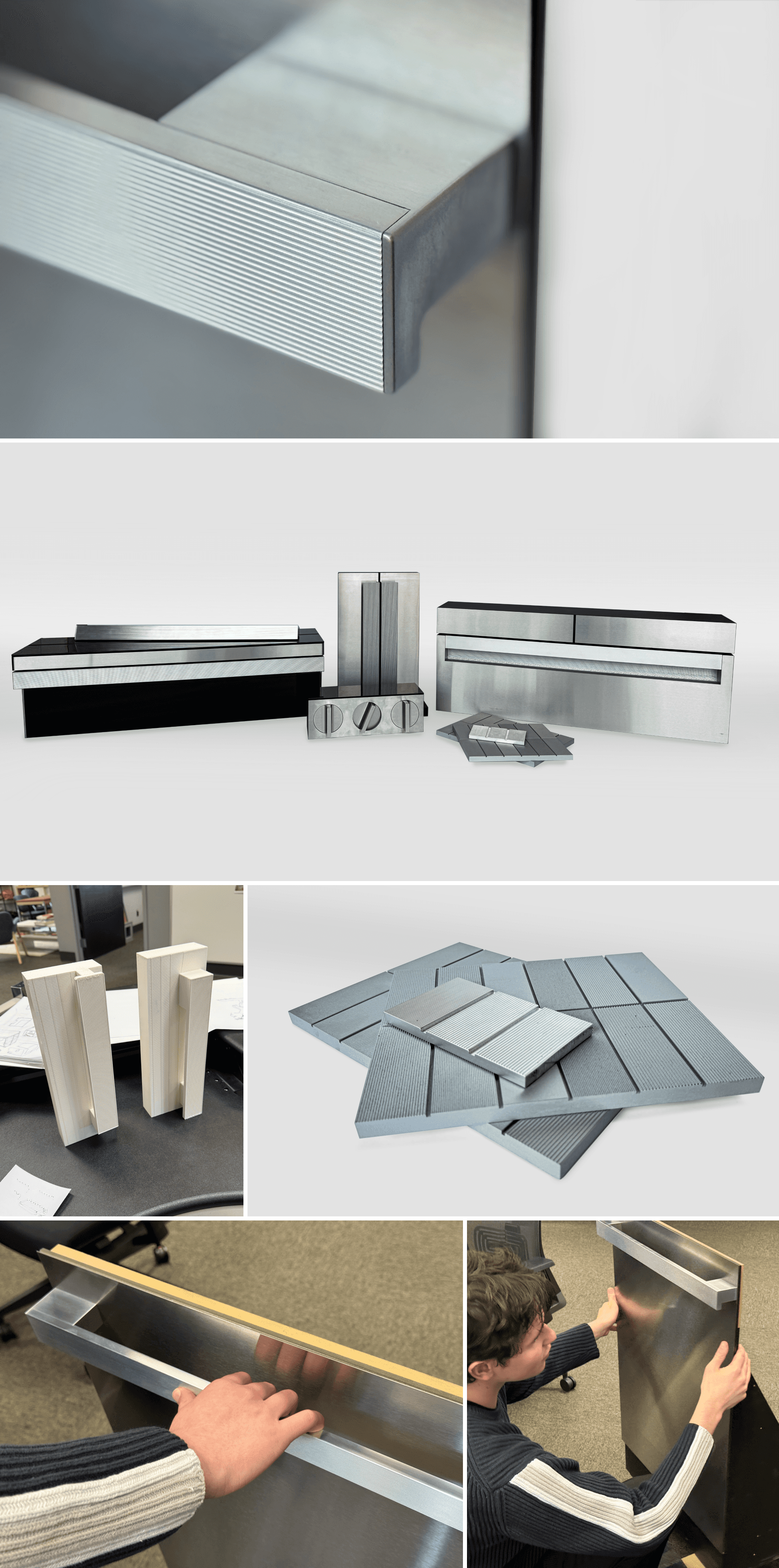
One of the key ways Profile can distinguish itself from GE is through any appliances most notable feature, the handle. We approached it as an evolution: retaining elements of GE’s design DNA while creating a distinctly recognizable feature for Profile. This led to the development of a unique form motif we call the “waterfall” handle.


Handle Prototyping
High fidelity prototypes tested grip diameter, transition geometry, and the visual weight of the waterfall motif across product scales. What reads well in CAD doesn't always translate to hand and physical prototyping kept the design grounded in what could actually be tooled, and exposed manufacturability questions before they became problems.
The Next Generation of Appliance Design

Integrated Handles are Integral
Integrated handles reduce visual noise and communicate a more premium feel. The signature waterfall motif carries through every configuration.

Flush Features
Flush-mounted controls and surface-integrated elements eliminate the visual noise that makes most appliances feel busy.

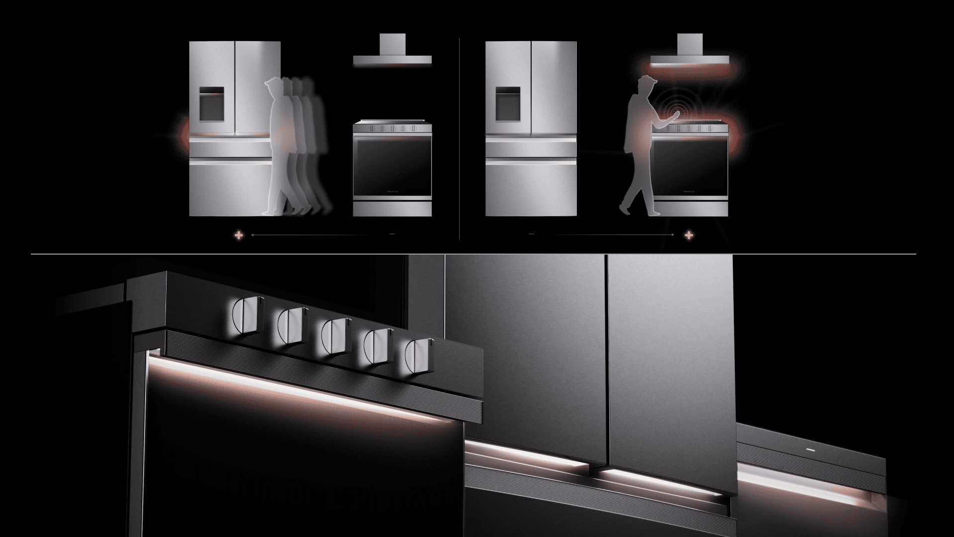
Light is More Than Illumination
Dynamic brightness adapts based on the task (features and functions)—soft glows for standby mode, focused beams for cooking, and ambient tones for guidance. Intelligent sensors ensure response in real time, enhancing usability while maintaining energy efficiency.
Stand Out By Blending In
Low-contrast gray glass offers a quieter, more premium finish. Where traditional appliance glass mirrors its surroundings, the reduced reflectivity of gray glass lets the brushed metal and form details do the talking.

Waterfall Handle
This evolution of GE;’s handle incorporates GE’s legacy design language while creating a distinct new visual elemnt that sets profile apart and makes it recogniozable in any kitchen or showroom floor.

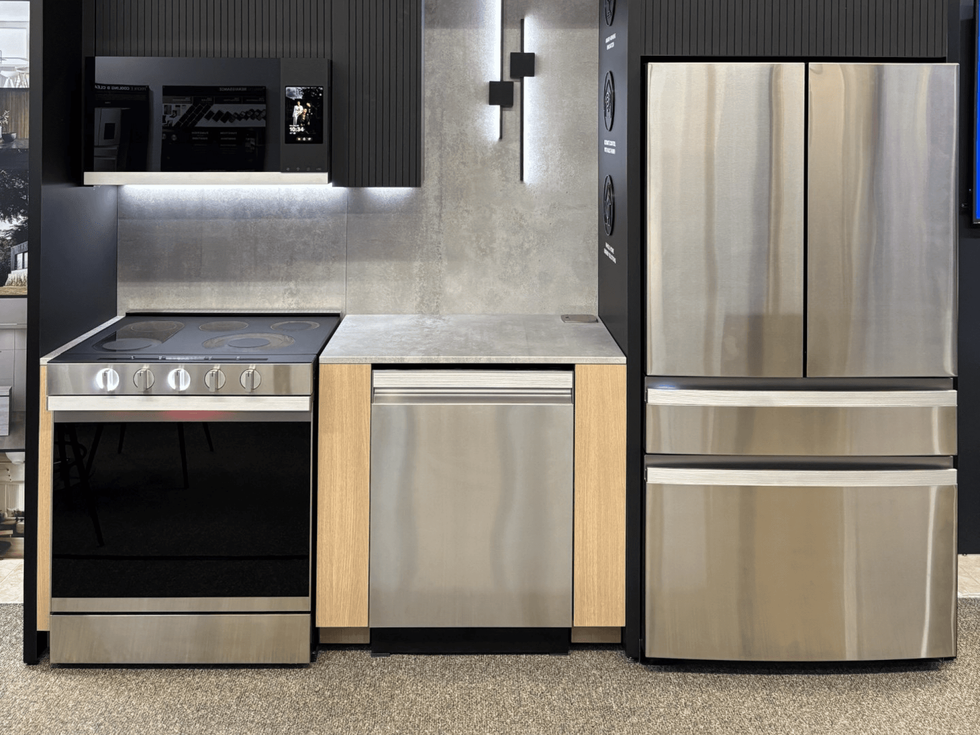
Full-Scale Prototypes
These high-fidelity prototypes marked the conclusion of my involvement in the design process — the final selected direction built for internal review and trade show display, proving the language at full scale for the first time.